FakeHaul
A pretend shopping marketplace where every checkout is $0.00 and nothing ships. The ritual of online shopping, without spending money.
I launched FakeHaul in July 2026 to find out whether shopping can feel satisfying without buying anything. You can browse, hunt for deals, check out, track an order, and open a virtual package, but you never pay and nothing ships. At its peak, FakeHaul reached 3,000 daily active users.

FakeHaul has been covered by The New York Times, Fast Company, MarketWatch, and Digital Trends, and mentioned by the BBC, NPR, Vice, CBC, and Futurism, among others. Read the coverage and the questions it raised.
The idea
I built FakeHaul for a friend who struggles with impulse shopping. My first thought was to block shopping sites or unsubscribe from deal emails, but I wondered whether there was another approach.
Sometimes finding the deal feels better than receiving the box. I wanted to test whether the browsing-and-checkout ritual could stand on its own, with no money spent and no clutter arriving at the door. That is still a hypothesis, and I’m not claiming the app treats compulsive shopping.
Building the illusion
I built a mobile-first marketplace with about 1,800 fictional products across eleven categories. It has the familiar mechanics: low-stock warnings, viewer counts, a daily spin wheel, and five-minute coupons.
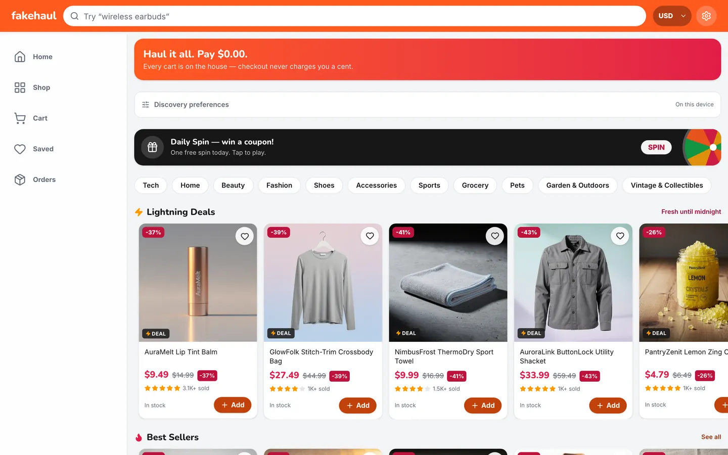
The tricky part was making it feel like a real store without misleading anyone about what it is. A product card might say “only 6 left,” but the header makes clear that checkout never charges a cent. The cart and wishlist stay in your browser, so you don’t need an account.
After checkout, the order moves through packed, shipped, and delivered states. A virtual package shakes until you tap it, then opens with confetti and a reveal of the retail value you “scored.” I spent time tuning that sequence in Framer Motion, because confetti that fires before the lid moves just feels wrong.
Generating the catalog
The catalog took as much writing as engineering, since placeholder text would have given the game away.
I used Azure OpenAI to generate structured records for product names, prices, ratings, and variants, then edited the listings by hand. The model gave me a first draft, and I didn’t want people scrolling through the same handful of AI jokes.
The live site reads static catalog data and compressed WebP images, so browsing never waits on a model call. The app uses Next.js 16’s App Router, React 19, TypeScript, and Tailwind CSS 4. Zustand persists the cart and orders locally, Vercel hosts the app, and Vercel Blob stores the static assets.
The tension
I kept coming back to the same problem: the app borrows pressure tactics from online stores, even though it doesn’t sell anything. Clear copy and a zero-dollar checkout make the premise explicit. However, they don’t settle what repeating the ritual does to someone’s habits.
Press and uncertainty
Coverage started in July 2026, during a wider conversation about “dopamine sites” that simulate consumption without selling anything, and it continued into October.
Additional coverage and commentary:
- MarketWatch looked at simulated shopping sprees alongside new consumer finance apps shaped by spending fatigue and financial anxiety.
- Digital Trends described feeling urgency from a countdown on a product that didn’t exist, and questioned the impulse loops behind it.
- NPR’s Planet Money included it in a newsletter roundup of sites that simulate online shopping, alongside FoodNeverComes and ImaginAir.
- Vice described it as a way to “experience the thrilling ritual of buying a thing that doesn’t exist.”
- CBC Radio’s The Current covered it among the mock shopping sites spreading beyond South Korea.
- Futurism called it a dopamine site that “convincingly imitates shopping on Temu.”
- Money Talks News called it “the biggest U.S. entry” in the trend and focused on its guardrails, including my plan to shut it down if the evidence turns against it.
- Newser focused on how completely the catalog is invented.
- t3n read it as a parody of online retail mechanics.
- Cybernews explored what AI makes possible for personal projects. We also discussed my choice not to collect accounts, email addresses, or IP-based tracking data. That leaves me without retention data, a trade-off I’m comfortable with.
- The Cool Down looked at shopping without spending, with the caveat that redirecting a habit isn’t the same as resolving it.
- Gizbot in India and Oti Simveni in Greece wrote it up for readers abroad.
I don’t know whether FakeHaul helps people change their shopping habits. The friend I built it for says it helps; a moderator of a shopping-addiction community warned me that rehearsing the ritual could reinforce it. Neither is enough to establish a broader outcome. FakeHaul is an entertainment product exploring an idea, and I don’t present it as a treatment. If people tell me it’s making things worse, I’m prepared to take it down.